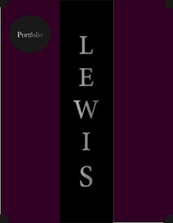
Portrait of Kenneth Lewis
recreated myself from a picture I had professionally taken a couple years ago. The picture to the left is the
picture, as the picture in the right is my design of that picture. Creating this art you can very easily
notice that I decided to change a few things of the picture. In the picture to the left, I have clear glasses,
a nice blue shirt, and a lighted background. However looking to the right, I have dark shades, a black
shirt, as well as blood red text displaying the word "POWER" in the back. I ultimately decided to put
this specific word because of the fact that I love reading. Soon to read one of the most famous books by
Robert Greene, "48 Laws of Power." This design did not actually take that long to make. In conclusion,
I enjoyed making this design because it looks exactly like me. I love how it came out in the end.


Kenneth, I really enjoy how your poster turned out. I love the reason you decided to use the word power as your focus point. I think my favorite part is on the bottom-most power where the colors change with the colors behind it. I feel that shows skill and was executed very well. Overall you did a great job on this
ReplyDelete