LOGO

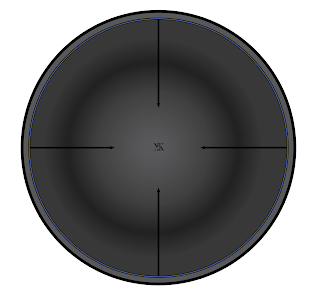
My logo symbolizes me because I made it like a sniper scope, meaning I am always focused. Staying focused on the end goal is an important factor to success, as well as always being patient. I also decided to put two letter K's in the middle of the scope in order to relate it to my first name. You can see the process I went through from the first sketch all the way up to the final concept. The first picture are the sketches I originally thought of, the second picture is the BW version, and the last picture are the different colors I chose (green, blue, & red).


Hi Kenneth, great job with this assignment. I really like how the logo represents the scope. I also like how your color pallet works really well together. The only recommendation I have it to maybe use a different font for the K to make it stand out better.
ReplyDelete