Posts

Portfolio

Image
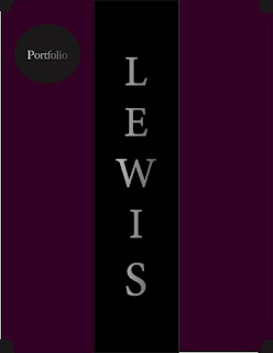
  Hello to anyone reading this! My name is Kenneth Lewis and this is my final Digital Media Portfolio  Project that I worked so diligently on. Making this was frustrating because I did not know how to  start. I also did not know what kind of design I wanted to go after. I finally decided to make the  cover of my portfolio like the same cover of one of the books I am currently reading in my free time,  called The 48 Laws of Power  by Robert Greene. I then put my own little twist in it by making the  color of the pages almost like a lilac color. This project took me more than about 1 full day in total in  order to complete. All in all, I am content on how it came out!

Somewhere

Image
In the pictures above, is my Somewhere project. The first image that is seen is the version I was able to create in the Photoshop software app. The second image that is seen is the original that I chose off the Internet. To explain what it is, it is a music video with the popular Lil Durk, DJ Khaled, and Lil Baby. They all made a successful song, then following it with a successful music video. This project did not take me too long to make because I knew what I was doing. All I pretty much had to do was cut myself out from my picture and place myself beside them. To also add, I managed to put a reflection under my left shoe, so it actually looked realistic. I enjoyed making this because I chose what I wanted it to be. It came out good to me!

My Business Card

Image
 These two pictures (green) is one of the business cards that I was able to create. I really wanted to make this one look cool to look at. Therefore I copied and pasted several of my logos on the front while also putting my last name in the middle. Then, on the back I put my "phone number" 3 different times but the middle one is pink with a black outline/stroke. I am happy on this came out. In these two pictures below (red) is yet another business card; front and back. For this, I put my logo on the left side of the card, then putting the other half a black rectangle with my first name initial and my last name. Then on the back of the card, I simply just made a gray oval with my "phone number" with a black background. My favorite part of this card is the back because it looks so mysterious with just a dark phone number. Lastly, for these two pictures (blue) is another business card that I made. I put a gradient rectangle on the left side of the front and put my logo

Indesign for Beginners

Image
  In this video, I think the tool that would be easiest to use for me is the "Text frame tool" which allows you to make text boxes to type in or past text in. I can paste other text into this text box by going to the top where the "Type" menu. Then going down to where it says "Fill with placeholder text." Once doing this, the computer will then paste the text that you wanted. This can be useful for many things such as text, pictures, illustrations, and more. This video was informal. https://youtu.be/7VpAisbfldI In this video, a tool that I did not understand before watching the video was the "Pen tool." However after watching this great video, I was able to easily fully understand how to use it properly. With this tool, I am able to manipulate shapes based on curves and points, as well as being able to type on these paths however I desire. I liked this video because it was straight to the point. https://youtu.be/AshfNo-i8Ws In this video, one thi

Autoscopy Project

Image
  My name is Kenneth Lewis and this is my Autoscopy project. As you can see to the left is my edited picture. I placed myself in the middle of the dark woods. To my left you can see a dog barking, to my right is Mona Lisa herself, as well as peanut butter jars on the bottom to dedicate my love for PB&J sandwiches. I wanted to make Mona Lisa look almost like a ghost, so I lowered the opacity of the embedded image of her to achieve this. However if you look even closer,  I put a picture of Marilyn Monroe and Betty Boop in the reflection of my shades. For the color of the picture, I wanted to give it a spooky feeling for the audience; that is why it is made with dark and eerie colors. I was able to do this by putting a Hue/Saturation filter on it, then manipulating the color sliders to my liking. My tag brush logo is seen in the middle of my forehead. I enjoyed making this project because I was able to make it however I chose. Nonetheless, it was not too hard to make. 

LOGO

Image
  My logo symbolizes me because I made it like a sniper scope, meaning I am always focused. Staying focused on the end goal is an important factor to success, as well as always being patient. I also decided to put two letter K's in the middle of the scope in order to relate it to my first name. You can see the process I went through from the first sketch all the way up to the final  concept. The first  picture are the sketches I originally thought of, the second picture is the BW version, and the last picture are the different colors I chose (green, blue, & red). I chose to use those specific colors in the tag brush in order for it to pop more to the viewer. I added the spray effect, scratch effect, and lighten effect in order to make this project. I enjoyed making this project because I was able to easily manipulate the colors etc. However, I liked making the self-portait project more than this one. All in all, I am happy on how it came out in the end.

pre-Somewhere

Image
  I think this picture would be the hardest for me to photoshop myself in. Due to the amount of space that is being taken up in the photo, there is not much space to do anything else. However, there is a huge blank spot in the top left. I will probably will be able to photoshop myself in that blank space. Link This image inspired my "Somewhere " project in many ways. Let's say for example I photoshop this picture. I can photoshop myself walking the goats, in the background  along with the trees, or even my face on the goats' faces. Link This picture actually made me laugh a bit when I seen it. I liked how the guy, who photoshopped the picture, put a towel on the guy's face. In doing so, makes the image much mysterious than previously. Without us seeing the face of the man, we must imagine a face onto him, simply by looking at everything but his face, like his figure. Very well photoshopped. I would want to recreate this illusion because of how realistic it seems,